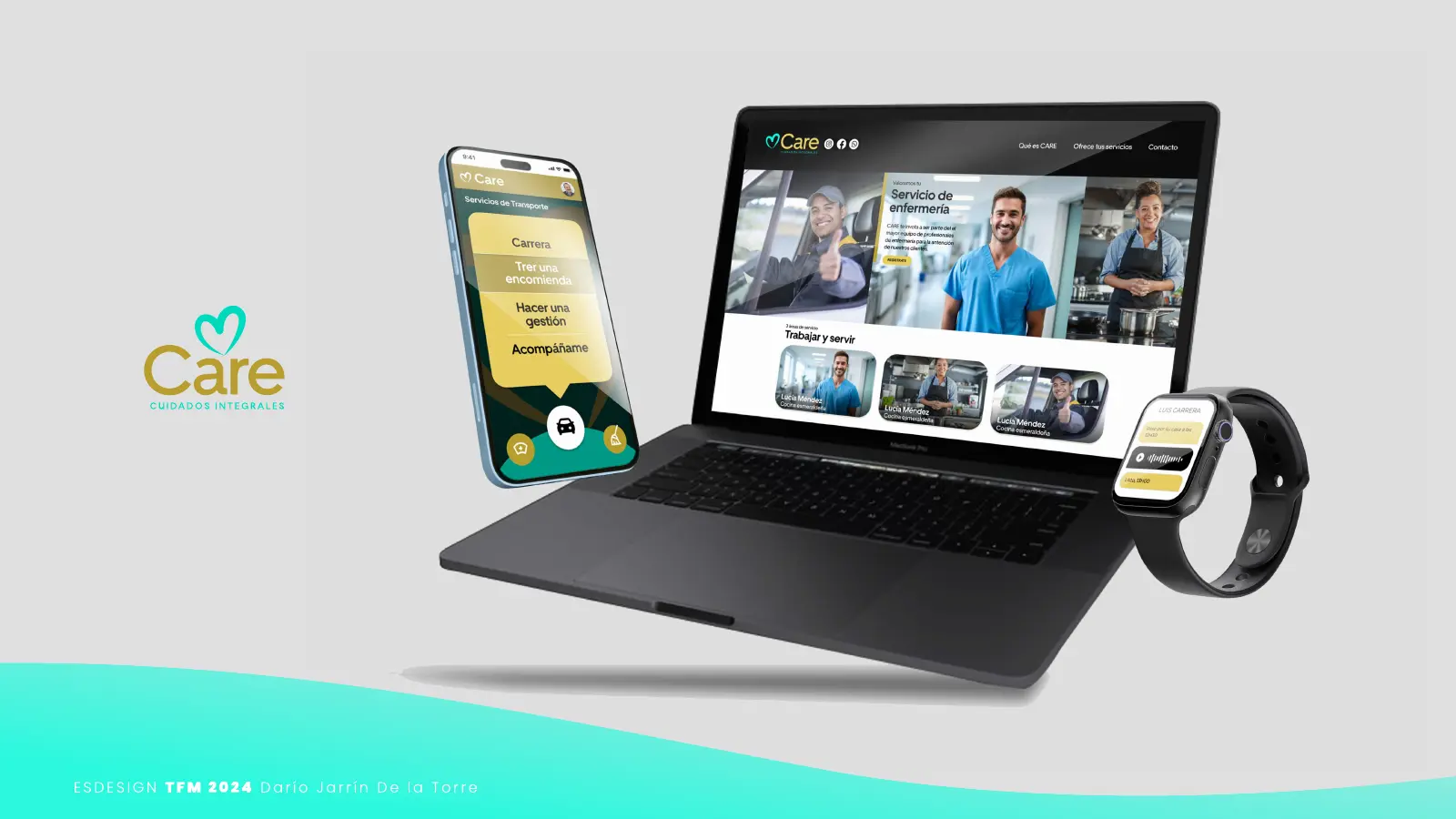
01 · Problem
Caring competes with the pace of life
Caring for our parents and grandparents competes with work and the pace of life. Older people or those with special needs feel like a burden when they depend on their family for everyday tasks. The services that could help them exist, but they are scattered: some highly institutionalized and others without any standard that builds trust.
02 · Users
Three profiles, one platform
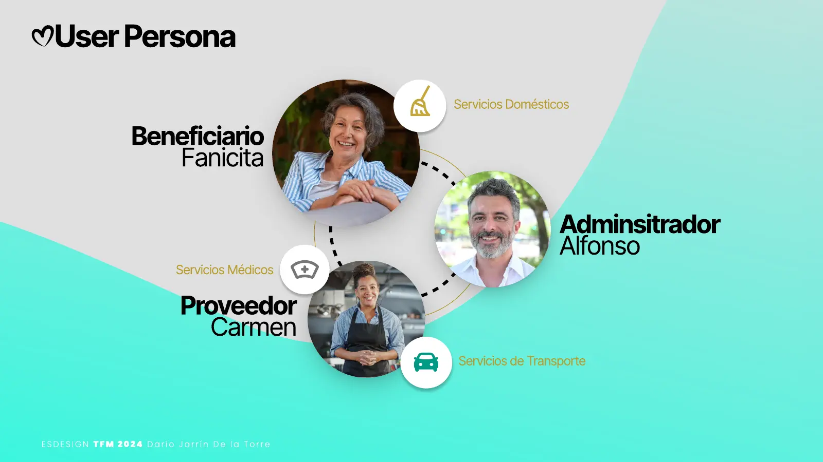
Three profiles connected by the same platform:
The administrator (Alfonso)
A son with a busy schedule who wants to be there for his family's needs. He hires, pays and monitors.
The beneficiary (Fanicita)
An active, widowed older adult. She wants to stay independent without being alone.
The provider (Carmen)
A cook, caregiver, nurse or driver who offers her service and needs people to trust her.
03 · Research
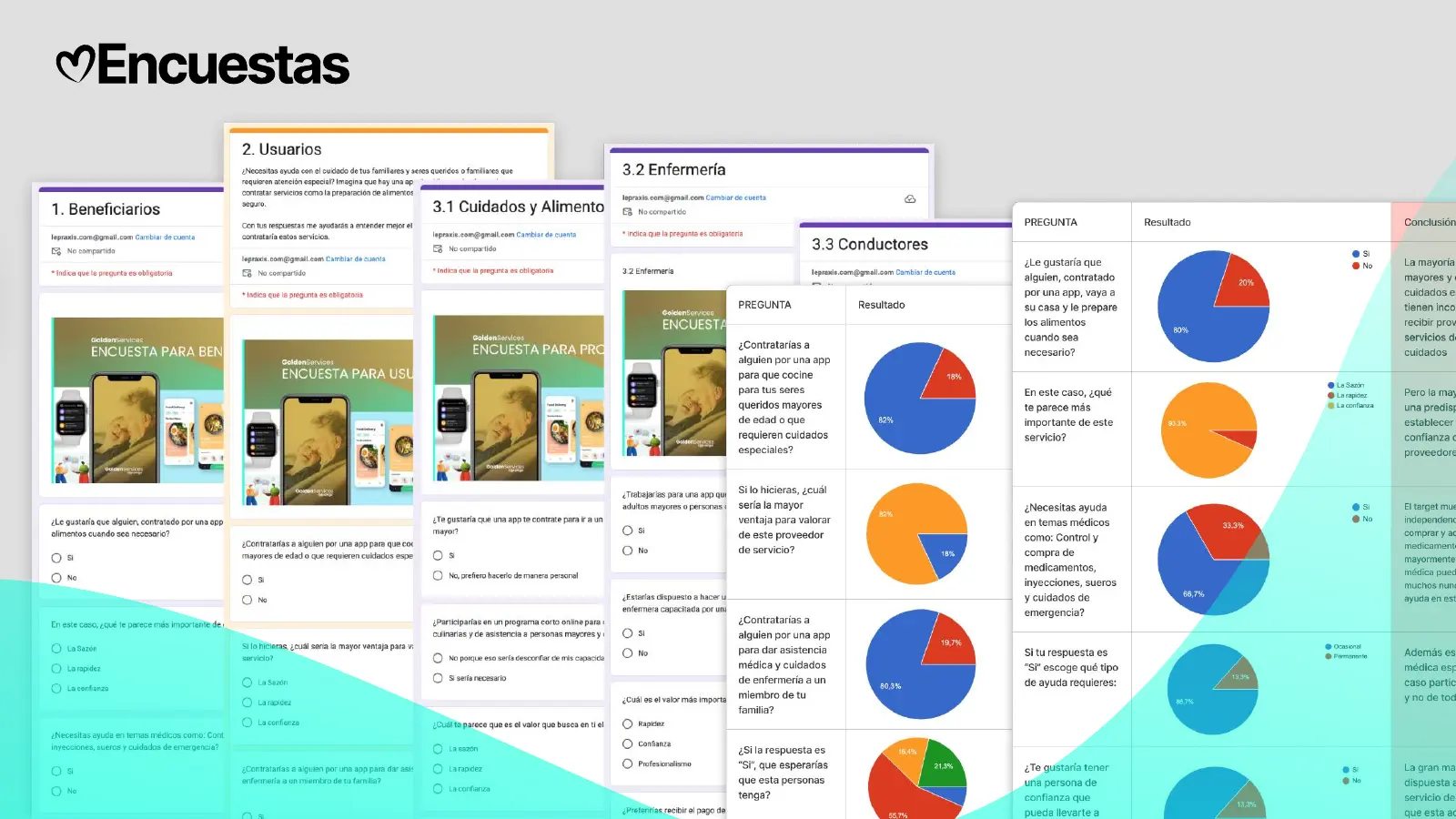
111 people, five surveys
Five online surveys, one per profile: beneficiaries (15 people), family members who would hire the service (61), home caregivers (21), nurses and drivers. 111 people in total. The results were analyzed and clustered on a FigJam board.
04 · Findings
What changed the design
- Trust weighs more than speed or price. Families and beneficiaries chose it as the most important value in a provider; for hiring nursing care, certification was the most valued requirement.
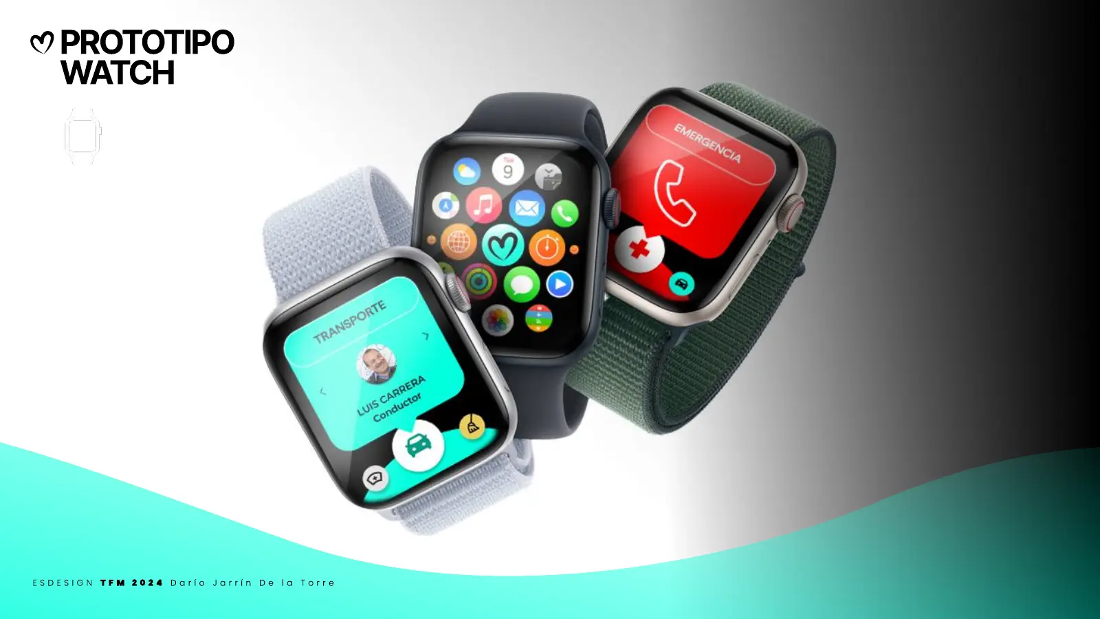
- 100% of respondents want an emergency button. Monitoring a loved one's well-being from the same app became a core feature.
- Transport is measured not in kilometers but in patience. Few users need an adapted vehicle; what they ask for is time and care on every trip. That is why the proposal charges by time rather than distance.
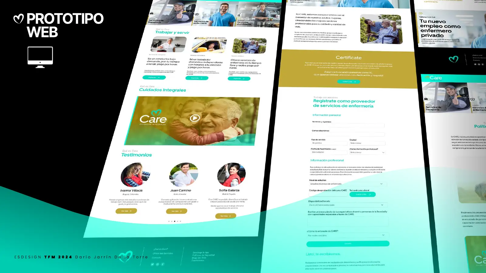
- Providers prefer to be paid on the spot, except nursing, which accepts monthly payment. And a long certification process drives them away: trust is better built with ratings on every service.
05 · UX/UI proposal
Simple for people who aren't fluent with phones
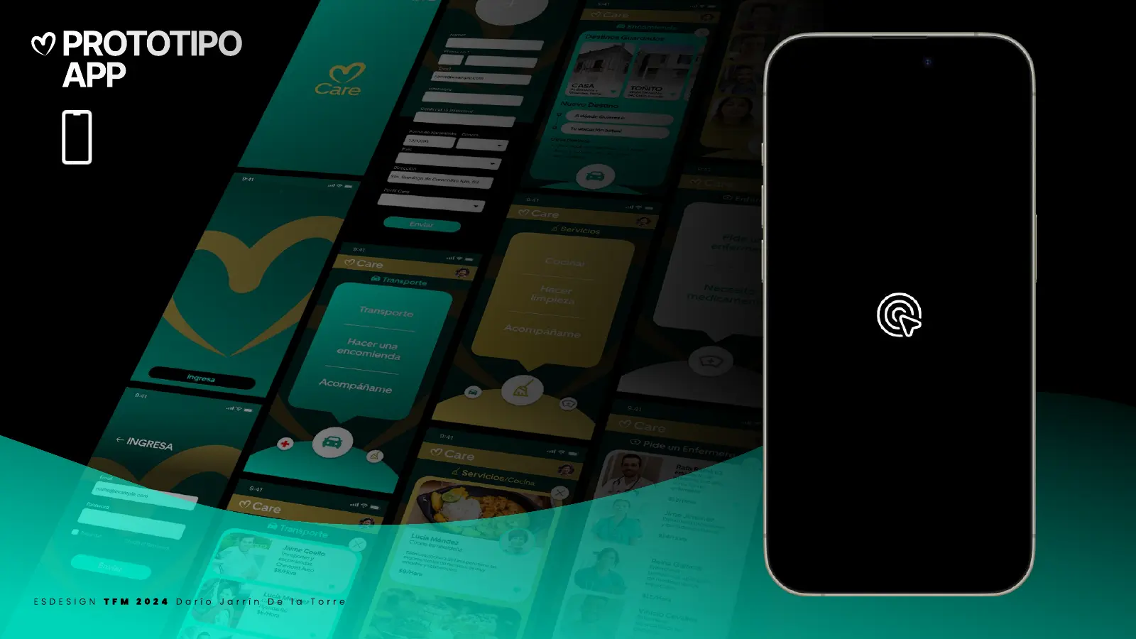
- Three products, one per user: the app for the administrator and beneficiary (hire, pay and follow the service), the web to register and train providers, and the Apple Watch so the person being cared for can ask for help or a ride without opening the app.
- Three services, three colors: home (gold), medical (gray) and transport (green). Color guides before text does.
- Navigation simpler than Uber or Glovo, its references, designed for someone who is not fluent with a phone: few options per screen, large buttons, only the information needed.
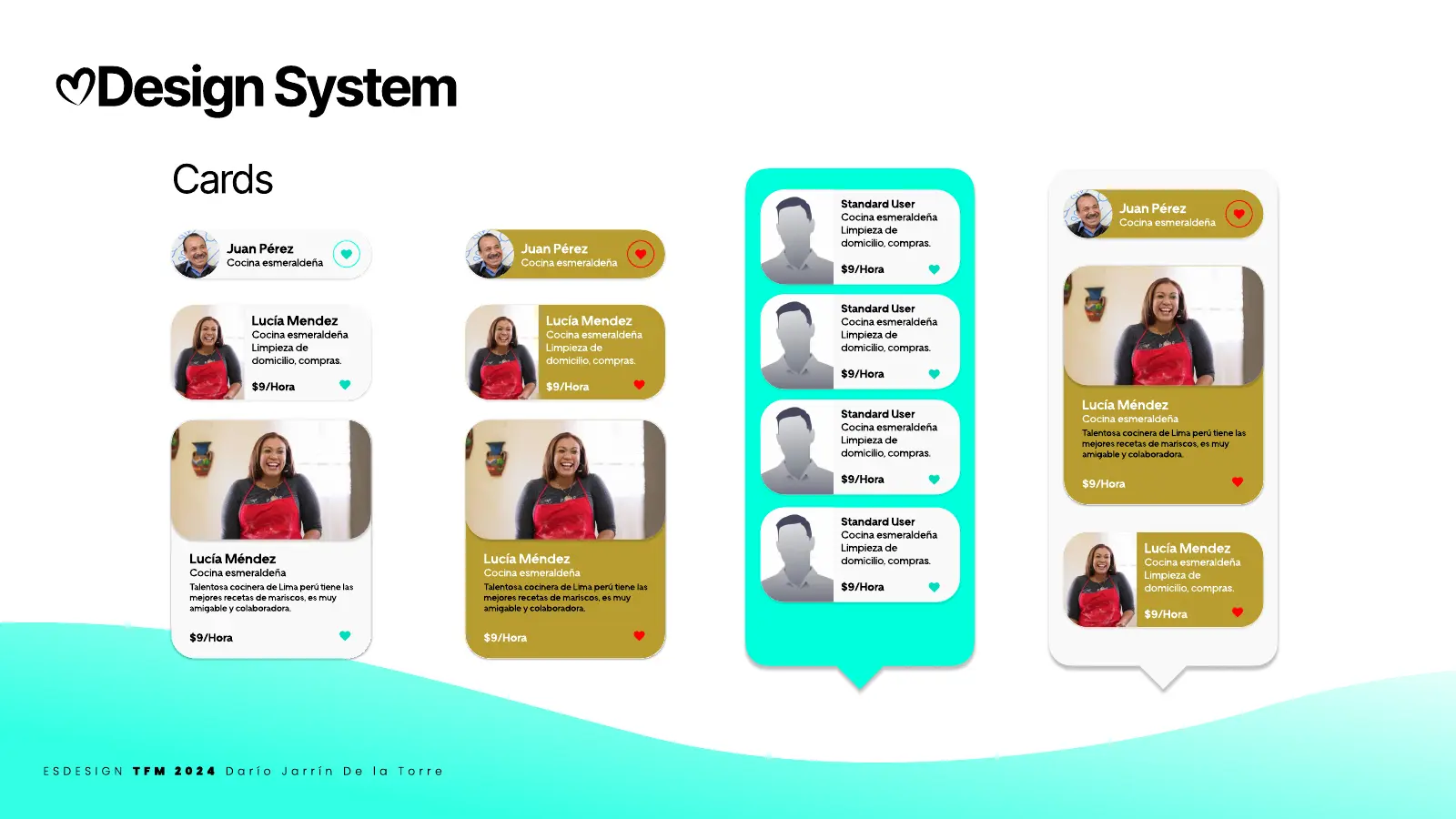
- Custom design system: 4, 8 and 12 column grid, 8 px base unit, typography, iconography, buttons and provider cards.
On video
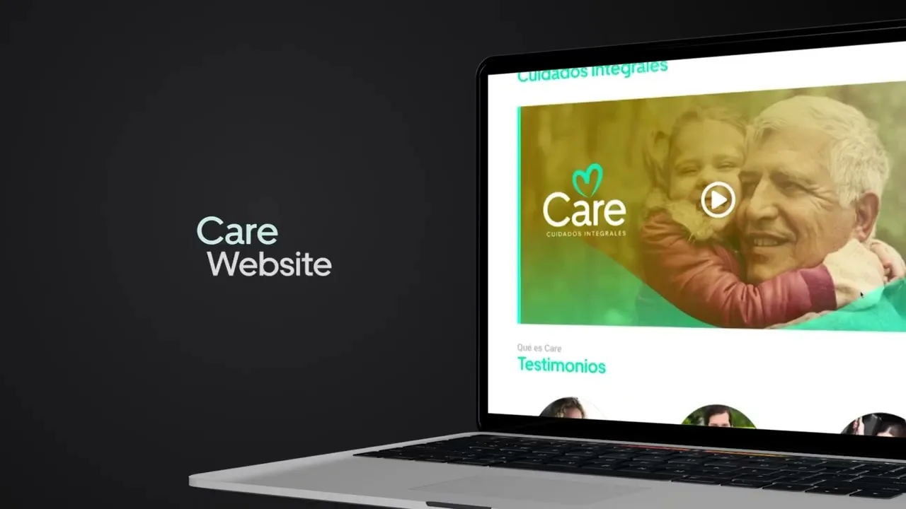
CARE App teaser
06 · Creative solution
An Uber for care, with a golden heart
An Uber-like model, but for care: it opens service demand to individuals and companies, and standardizes quality with ratings on every interaction that set experienced providers apart from new ones.
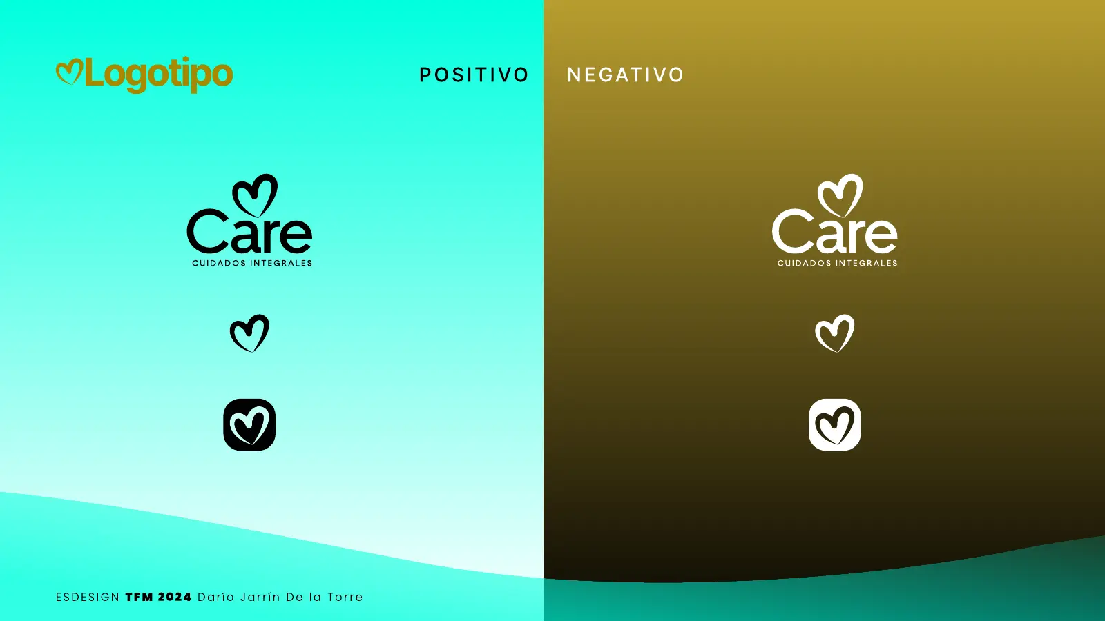
The name went from "Golden Services" to CARE: a short word, easy to remember even for older audiences, and a golden heart that connects with the "golden age". In the app, a playful side-swipe menu makes asking for help almost a game.
07 · Deliverables
What was delivered
- Research with 111 people and analysis in FigJam
- User personas and a map of three user types
- Naming, logo and brand applications
- Design system
- Information architecture for app, web and Apple Watch
- Wireframes and high-fidelity prototypes for all three products
08 · Result
Technology for people who are rarely considered
Project approved as the Master's thesis of the Master's in Multi-device Web Design UX/UI at ESDesign Barcelona (2024), supervised by Josep Ortega. CARE shows that technology can serve groups that are rarely considered in digital product design, connecting three different users in a shared benefit for all.